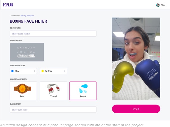

Poplar specialise in 3D and Augmented Reality (AR) experiences across desktop and mobile platforms. Poplar’s own web based platform allows AR creators to showcase their talent, and provide opportunities to work with brands on bespoke projects.
They approached me to conceptualise a digital marketplace where customers could purchase AR experiences on demand. Primarily aimed towards brands, these customisable experiences would allow marketers to advertise their brand via AR ready platforms such as Snapchat, Facebook and Instagram.
Branding
UX Design
UI Design
I was given the opportunity to work on this project through an old colleague and freind, now the Co-Founder and CTO of Poplar. He explained they were looking for new ways to generate income and extend the company portfolio. The brief was to conceptualise a marketplace where users could purchase mobile AR experiences on demand. These experiences would take the form of Face Filters, World Lenses, Image Scanning and Games.
The marketplace would allow AR creators to register and upload their own AR experiences to sell on the platform.

One of Poplar’s main revenue streams comes from working with Brands to create custom AR experiences. They do this through their existing platform which allows marketers and brand advocates to submit creative briefs to which creators can pitch for. Through this existing client base we were able to gain valuable insights into how marketers use AR as part of their marketing strategy, how creators showcase their talent, and their thoughts on the idea of an AR marketplace.
These insights were gained through a short series of online interviews and questionnaires which allowed us to create a set of personas to help define the needs and goals of potential users.


Once the users had been established and their needs quantified, the next stage was to begin thinking about creating a site map and tracking the user journey through the marketplace. Before this phase of the project began I had an open discussion with members of the Poplar team about what technology might be used to catalog user information, and how that information would be presented back to them. From this we were able to determine what was and wasn’t possible with the current technological and team capabilities.
Through manual research of existing platforms including Biteable, Blippar and Vidsy, I was able to identify common patterns in their user flows, paying attention to the sign up, log in and checkout journeys. To broaden the scope of research, I also looked at platforms I personally use such as Shutterstock and Creative Market. This helped establish the tried and tested models for common user flows on such platforms, and identified any steps that may deter, or unnecessarily extend the user journey.

Before any work began on wireframing we discussed UX requirements, what we wanted the user to see and interact with. An example of this would be when a user views a product, the image, title, description and price are all common attributes found on product pages. For this type of product we also needed to inform the user of the AR type and platform. Once these were established across each section of the marketplace we looked for examples of inspired UX design to aid in the wireframing process with regards to layout and functionality.
I first began with low fidelity wireframes drawn by hand to gather quick feedback. Once we were happy with these I then created interactive versions to more accurately represent the user interaction and animation. This entire process was iterated until we were happy with the outcome.


Once the interactive wireframes were signed off I began creating the visuals. There were no UI style guides to reference at this stage so I followed the brand guidelines in terms of fonts and colour schemes. The introduction of new design elements not seen within their existing platforms required new styles to be created.
The visuals were created in Sketch and made interactive using InVision. Please see below a selection of the visuals I created.


As this was a conceptual project with a fairly quick turn around, certain stages of the design process would need to be expanded upon and developed further if an MVP were to be developed. Outlined below are some of the areas that would have to be expanded upon;
The Poplar team were extremely happy with the work I produced in the allotted timescale. I continue to work with them on freelance projects.