
LOYAL AI is an exciting suite of tools for writers, journalists and bloggers. Its flagship product is an Editorial Research Assistant (ERA) in the form of a Google Chrome Extension (GCE) that works with Google Docs to provide research and insights into what the user is writing about. Part of the ERA product includes a web application where users can create an account and manage their sources. I was tasked with designing the UI/UX for the web app with the aim of on-boarding users who wanted to trial the product.
Below documents the design journey of the App.
UX Design
UI Design
The first step in designing the app was to try and understand what we wanted the user to achieve and how they were going interact with it. From the product research undertaken in step 3 of the ERA design process we realised that certain user operations should be separated from the ERA and would only be achieved through the app, we listed these as follows:
After evaluating the user goals defined above and the insights obtained from the market research we knew that the app would be presented in a dashboard style layout. The two common types of dashboard design are operational and analytical. We knew that the app would be operational rather than analytical as the user needed to able to complete the various goals outlined above. It was also apparent that the dashboard would contain very little (if any) analytical data, for the MVP at least.
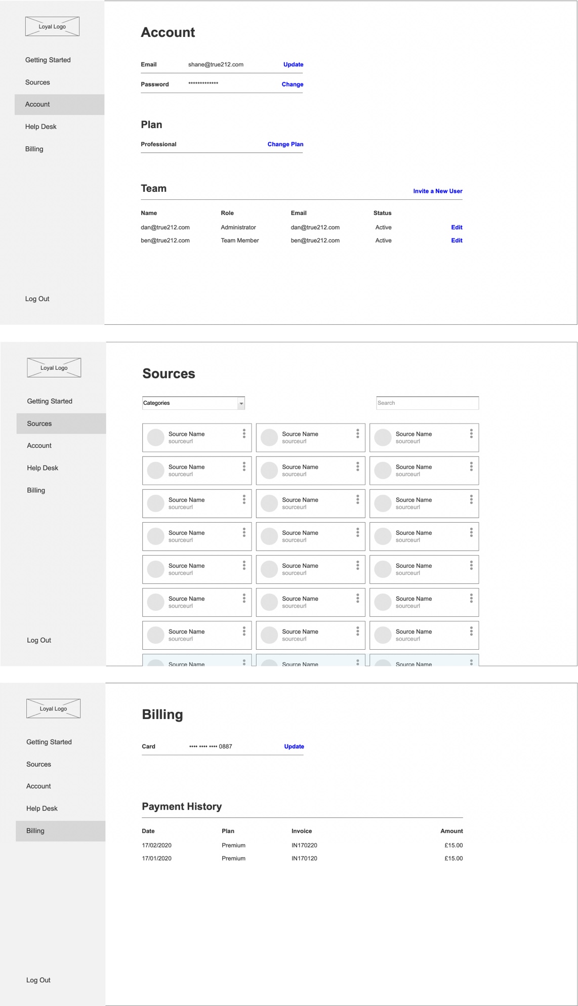
I worked on wireframing the solution, categorising the user operations and assigning relevant pages for each. Through research insights and collective agreement we decided the pages would be Sources, Account and Billing.

As a team we researched and compared a collection of popular SaaS providers to identify sign up/register best practices. I also looked at a number of online resources for advice and inspiration, and shared them with the team for feedback.
We found that there are 6 common onboarding processes:
Not all of these processes are required, however we used them as a guide when scoping the onboarding process.
We wanted the user sign up to be as quick and painless as possible so we kept the input data to email and password to try and keep the rate of conversion high. Following this we also offered the option of social media sign up via Facebook and Google as another way to speed up the process.
We decided to use one of the more common user flows where the user was required to verify their email address to access the app. Another common flow is to instantly access the app after signup, however we decided on verification first to prevent potential spammers as well as being able to use their email for potential marketing purposes.

Access to the app after a number of steps

The full user flow of the app
With the product manager I helped plan and design a number of automated emails which would be sent out to the user once they’ve signed up. This included a welcome email followed by a number of marketing and informative emails on how to use the ERA.

Examples of some of the campaign emails
To entice users to try the product we decided to offer a free trial period. It was important to welcome and inform the user of what they had signed up for and the next steps in using the product.
We designed a series of interactions that instructed the user of the conditions of the free trial, where to download the GCE and where to find support if needed.

Our version of ‘Out of the Box’ Onboarding
After the initial onboarding process we decided to create a series of short tours for each section of the app to guide and inform the user. These are commonly seen in web applications when a user is first onboarded and are useful for a number of reasons;
We highlighted useful features using coach marks and put them in order of importance with the option to quickly close if the user wanted to exit the tour.

An example of 3 coach marks that appear in sequence on the ‘My Sources’ page
The visuals were designed with UI best practice is mind, and the fundamentals followed with regards to UI patterns, design hierarchy and elements.
I expanded upon the brand guidelines, introducing new colours, font sizes and weights and created the beginnings of a design system. I documented the styling of components and states so these could be used as a reference in future designs.

App Styleguide
Although the app was to be used primarily on desktop devices it was still designed responsively, working just as effectively on tablet and mobile devices.
Please see below a collection of visuals that showcase various parts of the app.


